I am awed, overwhelmed, intrigued, challenged and critical
of this book.
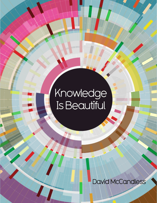
Knowledge is Beautiful by David McCandless is a stunning
display of information; each page is packed with the same amount of information
found in a chapter or even the entirety of a book. But all of this information is represented
with color, shapes and arrangements to demonstrate, not just the pieces of the
facts but also their relationship to each other.
That’s a lot to ask from a bunch of shapes on paper but with
the field of infographics, that is the ultimate goal. Represent as much information as possible
with as few words as possible. Show
ratios, proportions and relationships all on a 2D plane. And David McCandless is a master artist
within this medium.
The challenge for me, however, is that I am a very verbal
person. I compulsively read words;
signs, subtitles, menus, anything! So I
often look over the illustrations in a book because they don’t have the same
impact for me. This was first challenged
when I read the fantastic book The Invention of Hugo Cabret by Brian Selznick which is a wonderful
interpretation of the concept of a “graphic novel”. The detailed illustrations are woven into and
tell the story in between the text. If
you don’t “read” the pictures, you can’t really follow the book. Great practice for me but not quite enough to
prepare me for McCandless’ onslaught of pictorial stimulation.
A dizzying array of subjects is offered, loosely separated
into four categories which are themselves shuffled like a deck of Vegas cards
so that examples from each section are combined, seemingly at random. Even looking at the table of contents is
somewhat confusing when you are trying to find the category for a certain
infographic and have to search for the page number because the table is not
sequential. When flipping through the book, you will find a graph on the
statistical probabilities of things happening to you; a one in “X” chance of
correctly guessing a roulette number twice in a row or dying in a car crash
driving to buy a Lotto ticket. The next
page features simple sketches of famous people (Jesus and Gandhi at the top)
with ratings of their viewpoints along an oppression/progression continuum. I would advise taking a deep breath before
turning pages to prepare yourself for the next assault of information.
That being said, this is chock full of great information,
and once understood these facts and relationships are remembered quite vividly
because of the visual representations. I
think the key is to have a few guidelines before setting out on the adventure:
- Remember that each infographic will have its own color scheme and legend of icons
- First look at the title and read the legend to find out what the colors, images and sizes represent
- Check to see how many pages a related infographic takes up. Some only 1, some 2 and some more; there might be page flipping involved
- Take a deep breath and move your eyes to something neutral in between disparate graphs
- Take it slowly, trying to read the entire book at once is like trying to listen to 7 college lectures simultaneously on different subjects.
- Try to appreciate both the informational aspects as well as the conceptual design at the same time
Factoid aficionados will find their match in this densely
represented set of information; no quirky sayings, no snarky one-liners to
memorize and toss out to unsuspecting bystanders but a satisfying baseline of
information on hundreds of different subjects.